
The Intricacies of the 60 30 10 Color Rule
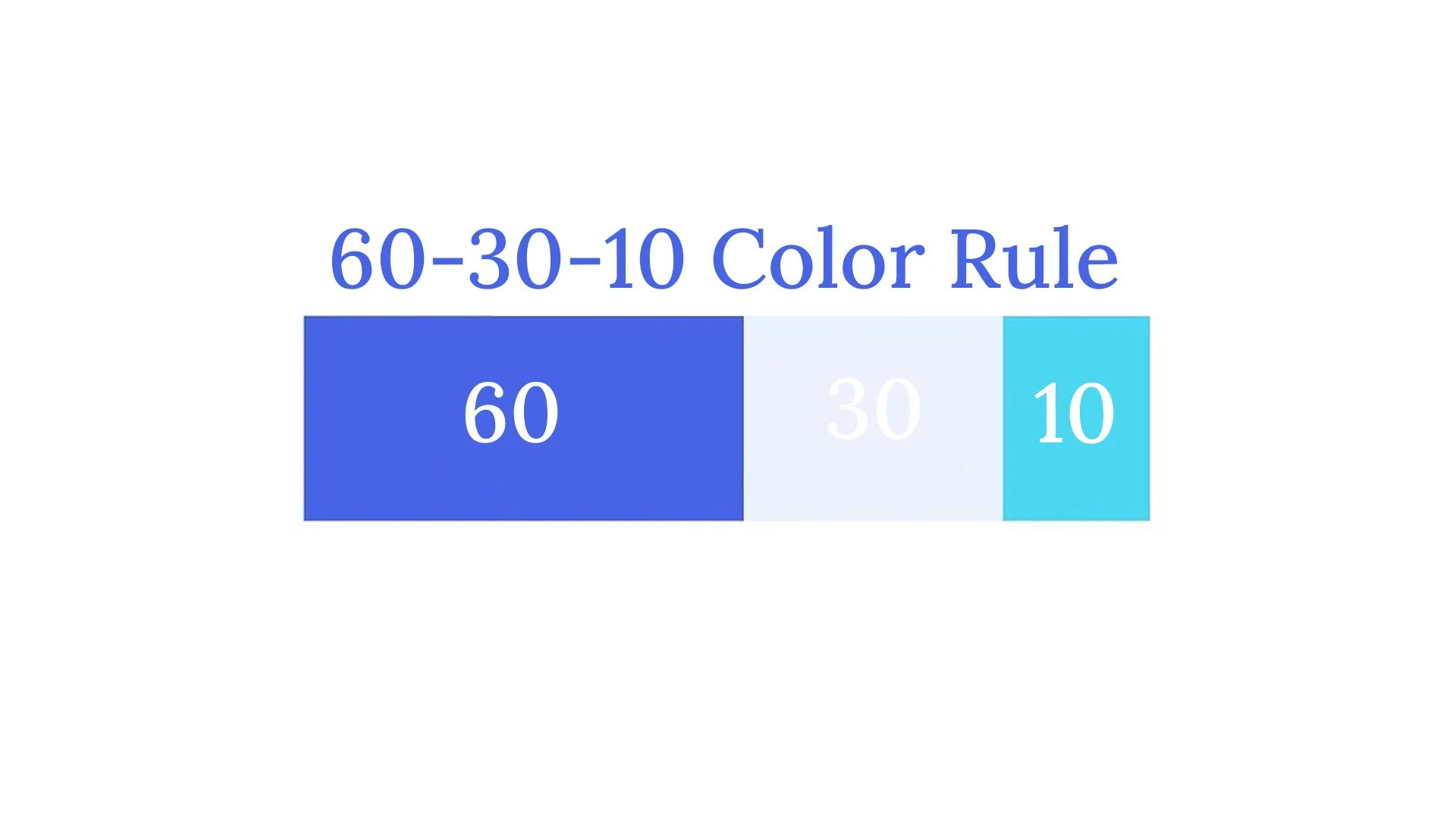
Image made in Adobe Photoshop
The 60, 30, 10 color rule is one of the most essential design guidelines in terms of how to specifically color a design and what is needed to make certain thing pop out over others. The rule specifically states that 60% of the design canvas is one color, 30% another color and 10% the final color. The 60% color is the dominant color, being the background, setting the mood and taking up a large portion of the design. The 30% color is the secondary color, supporting the dominant color and adding contrast to the overall design. The 10% color is the accent color, adding a color pop to certain aspects of the design. It is important to understand all of this because it is a simple set of guidelines that can truly make a difference in terms of graphic and interactive design.
Implementing this rule will not only add to visual hierarchy and help the layout of the design but it will allow the designer to play with available colors and find out what works best for the design. The more experience a designer gets with colors and this rule, the better off they will be in the future in terms of being able to expand the kind of work that they are able to do. The rule is very multifaceted in ways that can be crossed between web and UX design, in motion graphics, graphic design, and even photography in certain aspects.
The rule itself is also generally very simple in nature in that it only seeks three different colors to make the design be sufficient for the colors to all work together. Along with that it is not a law, and it can be broken, it is simply just a set of guidelines, allowing for flexibility in design work. While that is the truth regarding the rule, following the rule will produce better quality work and that is something that every designer should understand and recognize.
I have always been one who wanted to learn more about color in design and color theory itself and this has helped me to further understand that. I see color and contrasting colors and typography and typefaces as some of the most important aspects of design. It may be hard to get the exact percents and colors on the design canvas that one is creating, but once it is found and realized it can help the design grow and get as good as it can be.
This rule ultimately not only makes designers better at what they do but it allows for them to learn more about the design process and further experiment in their work, allowing them to grow and expand their careers. I am not by any means a professional graphic designer and am far from it, but understanding this rule has helped me to further my specific design skill set and learn more about how graphic and interactive designers are so incredibly talented. This rule helped me to understand what it takes to become a professional designer and how I can implement it into my everyday design work, whether that is for academics or for my professional career and creative portfolio.